Designing a token-driven component system with configurable APIs, documented interaction states, and a shared delivery model for designers and engineers.

Type
Design System
Role
Senior Product Designer
Team
Product Designer(2)
Engineer(3)
Project Manager(1)
Skills
Systems Design
Design Tokens
Component Architecture Documentation
Accessibility
Overview
A growing product needed a single source of truth.
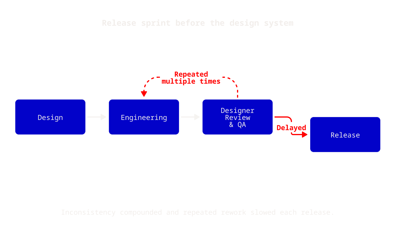
As Amazon IVS expanded, new broadcasting and audience-interaction features introduced duplicated patterns, inconsistent states, and repeated design decisions. Reviews increasingly focused on visual drift and implementation differences instead of product behaviour. The opportunity was to create a shared system that could absorb new capabilities while keeping the experience coherent.
BUILDING ALONGSIDE THE PRODUCT
Start with the patterns used most, then improve the system with every release.
I audited the existing interface, grouped repeated patterns, and prioritized the foundations with the greatest product reach. Rather than pause feature delivery for a complete rebuild, I introduced the system incrementally. Each release became an opportunity to consolidate decisions, migrate high-use patterns, and make the next feature easier to design and implement.
TOKEN FOUNDATIONS

Variables turned repeated visual decisions into reusable foundations.
Tokens centralized decisions that had previously lived inside individual screens and components. Consistent naming and variable bindings allowed component states to inherit shared values and made changes easier to propagate. As the library matured, Button colors moved to variables and hover treatments were revised through shared color and transparency decisions instead of one-off overrides.
COMPONENT ARCHITECTURE
A configurable API made components predictable across use cases.
Components were designed as configurable components built atomically rather than static visual assets. For example the button component used defined variables, size, radius, icon configuration, and interaction state so designers and engineers could compose approved combinations without recreating the component for every feature.
Documentation & context

The component API gave design and engineering the same language.
Shared property names, defaults, interaction states, and usage guidance reduced the translation gap between a Figma component and its implementation. Decisions about spacing, icon placement, loading behaviour, and edge cases were documented at the component level so handoff focused on product intent instead of reconstructing visual rules.
The library was maintained as a product, not delivered as a one-time file.
Usage guidance captured when and why to choose each pattern. Documented concerns made unresolved questions visible, while dated update logs recorded changes. This change history helped the team understand what evolved, why it changed, and whether existing implementations needed attention.
SYSTEM IN THE PRODUCT
The system supported the operational complexity of a live-streaming product.
Shared foundations appeared across broadcast setup, camera and microphone controls, guest invitations, stream-health monitoring, chat, quizzes, polls, notices, and celebrations. Reusing the same interaction patterns and status language helped these workflows feel like one product even as the feature set continued to grow.
IMPACT & REFLECTION
The outcome was a shared interface contract—not merely a Figma library.
The token-driven system gave design and engineering a maintainable foundation for product growth. It made component decisions visible, changes traceable, and new workflows easier to assemble from trusted patterns.